In Geneva, behind the windows of the M.A.D. Gallery, Eric Giroud reveals how the M.A.D.2 came to life. It is a story of collaboration, experimentation, and a more “democratic” take on high watchmaking.
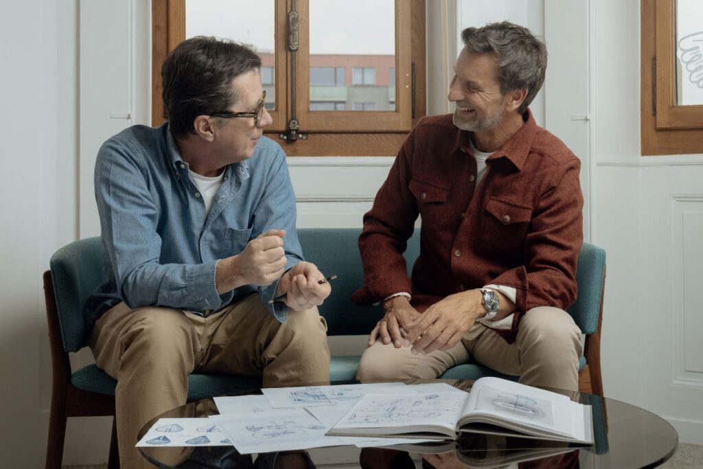
I had the good fortune to meet him in the inner sanctum of the M.A.D. Gallery in Geneva during the week of Watches & Wonders. Waiting for me there with Charris Yadigaroglou, Head of Marketing Communications at MB&F and a long-time friend of MB&F founder Maximilian Büsser. Eric Giroud belongs to the brand’s close inner circle, to the famous “F” — Max’s Friends. He is the kind of designer who does not impose a signature style, but instead adapts to the DNA of each project. And that, as they explained to me, may well be his greatest talent. Most people do not realize it, but Giroud has had a hand in almost every MB&F creation of the past 20 years. Not as a “star designer,” but as the person who takes Max’s ideas and turns them into objects. “Max has the incredible ideas, but he cannot draw them. That’s where I come in,” he tells me, almost apologetically. “I’m not the brain. I’m the one who experiments.”
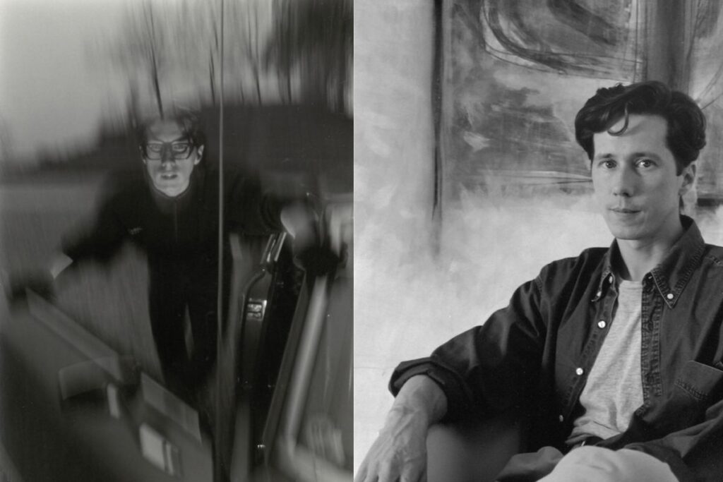
Eric Giroud and Max Büsser at the MB&F offices. Their friendship and professional collaboration have spanned at least twenty years. (photo: MB&F)
From MAD1 to MAD2: the idea of “democratic” watchmaking
Naturally, our conversation begins with the M.A.D.2. Not with the watch itself, however, but with the philosophy behind it. “Most people cannot afford an MB&F. Neither can we,” he says with a laugh. And that is precisely where the idea for M.A.D.Editions was born: a more accessible, yet equally creative, expression of the brand. This idea is not new. It had already existed in the early years of MB&F, in the form of a project called “Green Dog” — a transparent plastic watch that never quite found its audience. “It wasn’t the right moment,” he recalls. In the end, it took almost a decade for that thought to mature and eventually lead to the MAD1. The MAD2 was the natural next step.
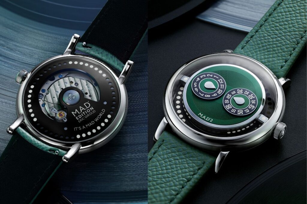
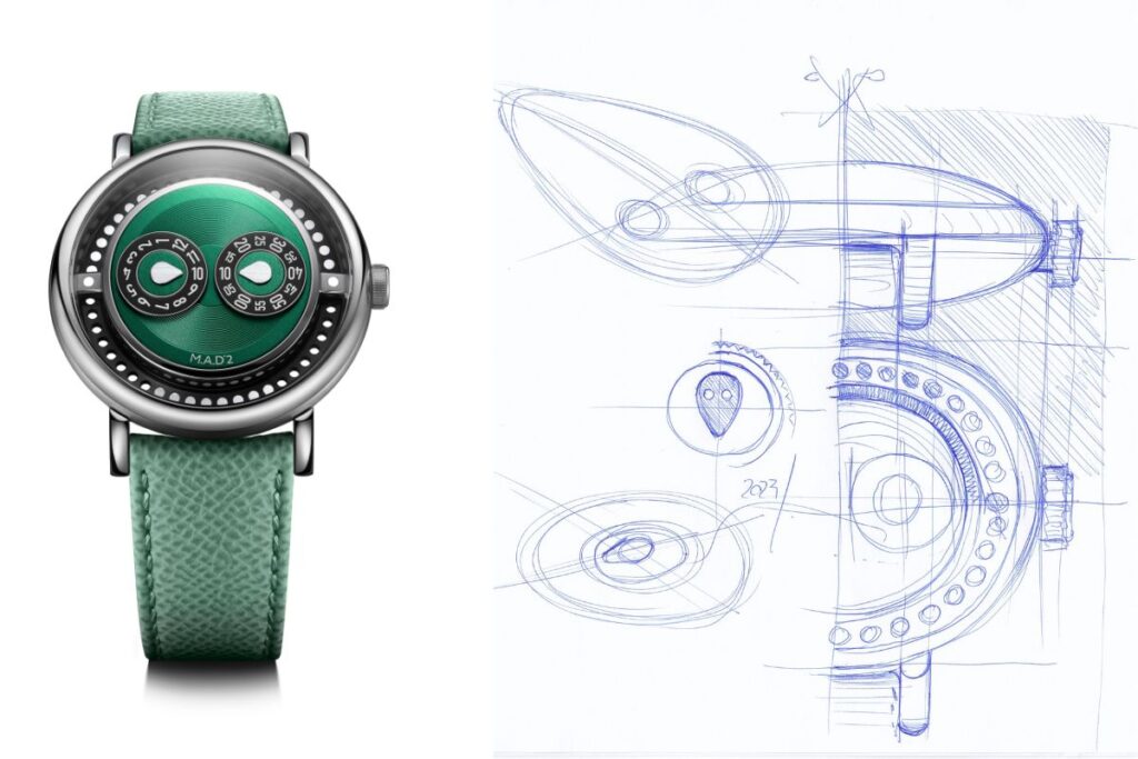
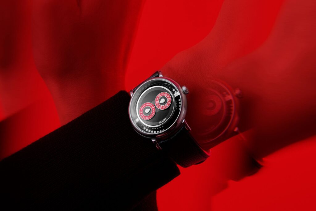
The two sides of the new M.A.D.2 designed by Giroud.
A different approach: the same DNA, a different “recipe”
If the MAD1 was explosive and unpredictable, the MAD2 is something else entirely. “It has the same ingredients,” he explains. “But cooked differently.” The central idea of the rotating rotor remains, but here the reading of time shifts. First you see the mechanical spectacle, and only then do you understand the time. “It is a watch first, and a tool second,” he says. “Whereas usually the opposite is true.” The choice of a jumping hour display, combined with the “peripheral” rotor, creates an experience that demands attention. It is not immediate. It is not easy. And that is exactly why it is so interesting.
Inspiration from music and the aesthetic of the 1990s
Unlike the more “architectural” approaches that were explored at the beginning and eventually abandoned, the MAD2 found its form through music. “Max loves music. So do I. That’s where we found common ground.” The result is a watch that evokes vinyl records, turntables, and the club culture of the 1990s. Not as a literal reference, but as a feeling. During our conversation, records by Nina Simone, Queen, and Marvin Gaye are passed around. The connection is not superficial. It is lived, personal, instinctive.
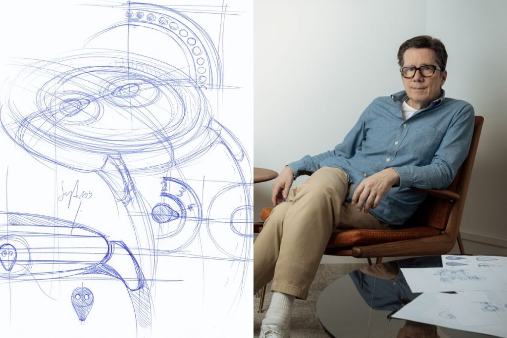
The design process: experimentation, failure and… teamwork
Perhaps the most valuable part of the conversation is hearing how Giroud actually works. There is no linear process. There is experimentation. “We do ten projects, and in the end two or three come out of it,” he says without hesitation. Everything begins with proportions. Diameter, thickness, structure. “Like a sandwich,” as he describes it. Then come the sketches. And then… the doubts. One of the first concepts for the MAD2 was abandoned after 18 months of work. “We just weren’t feeling it,” he says simply. But that, too, is part of the process.
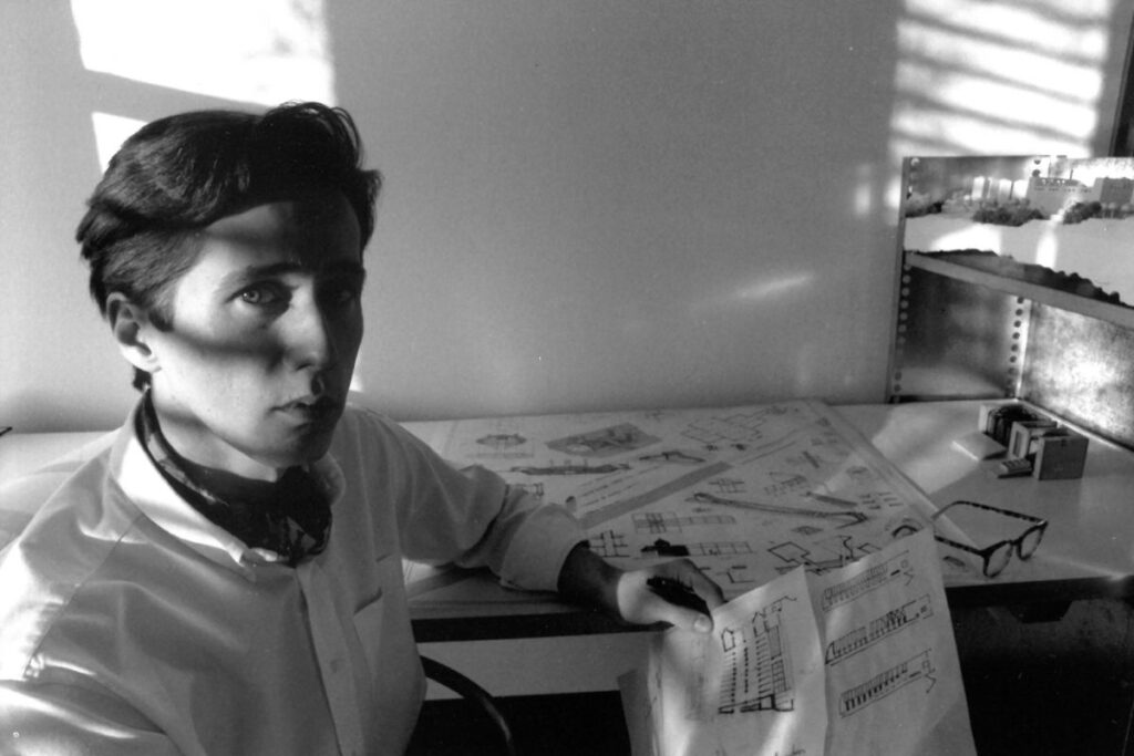
O Eric Giroud at a young age. (photo: MB&F)
The role of the team: no idea is sacred
Unlike other brands, where the designer often works in isolation, at MB&F everything passes through the team. “Everyone can speak. Suggest. Disagree.” Even details such as whether the hour discs should be “floating” or not emerged through collective discussion. The same goes for the colours. Giroud himself admits that his initial proposals were… “boring.” “Blue and beige. Very safe.” Until the younger team at MB&F came forward with bolder ideas. And in the end, those were the ones that prevailed.
The problem with colour: a hidden difficulty
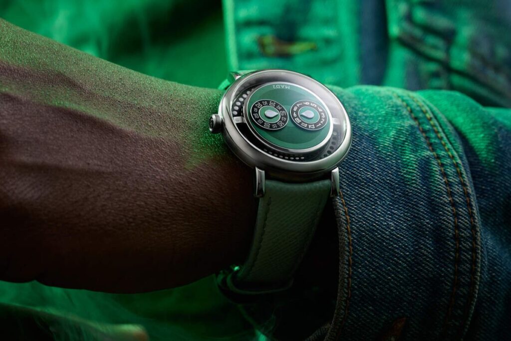
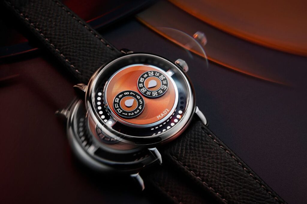
From the outside, it looks simple. From the inside, it is anything but. Matching the same colour across different materials is, as he says, “a nightmare.” Dial, discs, case, strap — they all react differently to light. Orange, for instance, created an unexpected problem: associations with Hermès. “If you put an orange strap on a watch, the mind goes straight there,” he says. That is why they chose a more metallic, more nuanced shade instead.
The M.A.D.2 was also released in an orange version, exclusively for members of The Tribe — collectors who already own at least one MB&F watch (not a M.A.D.Editions piece).
A more “classic” M.A.D.?
Despite its unusual aesthetic, the MAD2 is perhaps the easiest-to-wear M.A.D. to date. And that is no coincidence. “I’m not an eccentric person,” he tells me. “I don’t wear eccentric watches, just as I don’t wear eccentric clothes.” Perhaps that is why the MAD2 finds such a fine balance between the experimental and the everyday. It is a watch you can understand, but not at first glance.
O Eric Giroud at a younger age (photos: MB&F)
The essence: a living process
As I leave the M.A.D. Gallery, what stays with me is not only the watch itself. It is the process behind it. The discussions, the disagreements, the trials, the failures. And, ultimately, an idea taking shape. “If you stay open, the project stays alive,” Giroud says. And perhaps that is what the M.A.D.2 really is in the end. Not just another good-looking watch, but proof that when creation is shared, it becomes far more compelling.
Watch the new M.A.D.2 come to life in the video below…
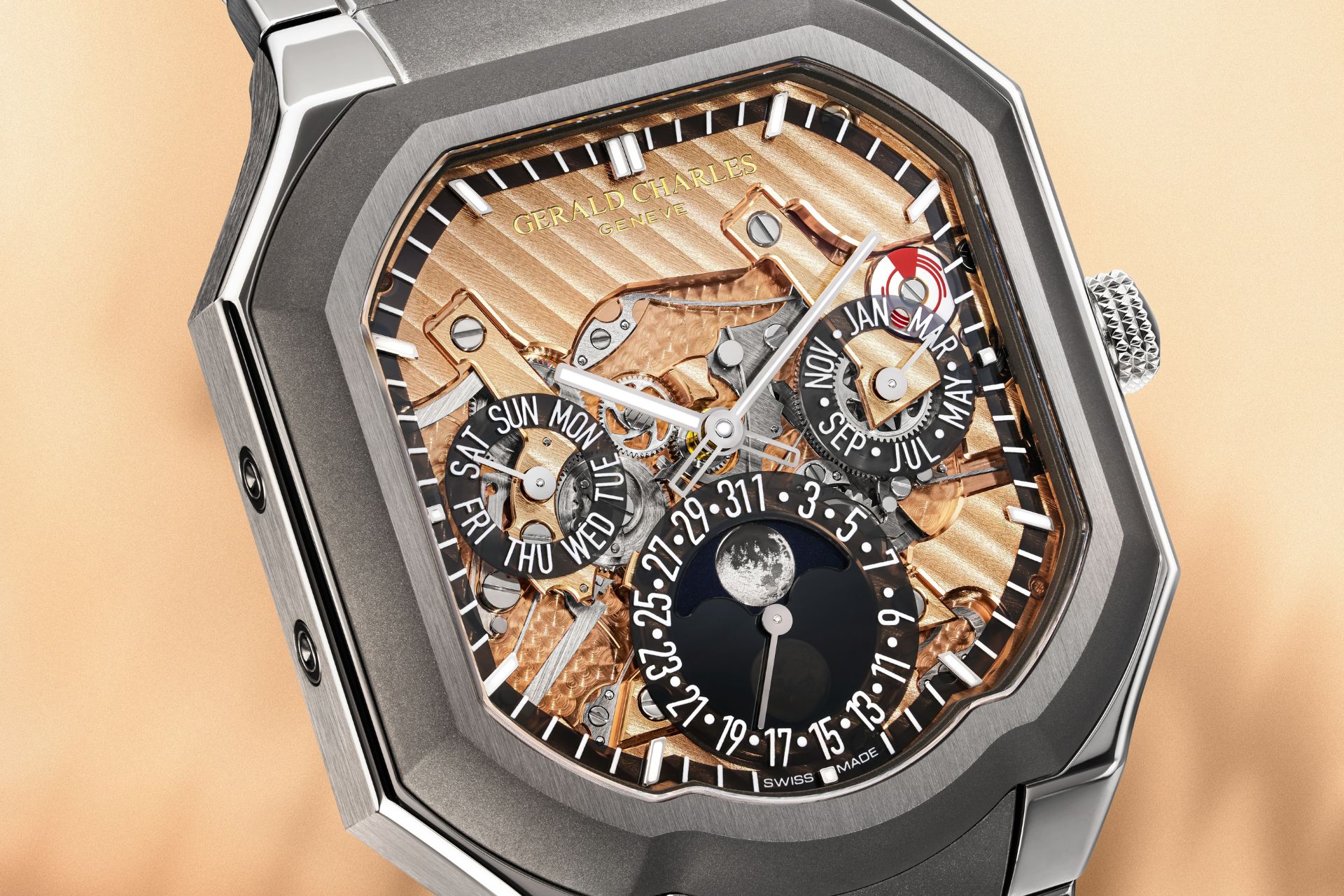
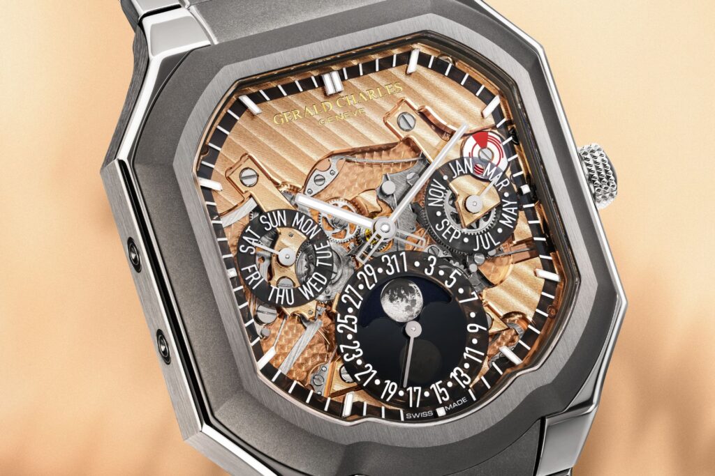
The world’s first in-house asymmetrical automatic perpetual calendar. The new Masterlink Perpetual Calendar shows how Gerald Charles reinterprets one of watchmaking’s most classic complications.
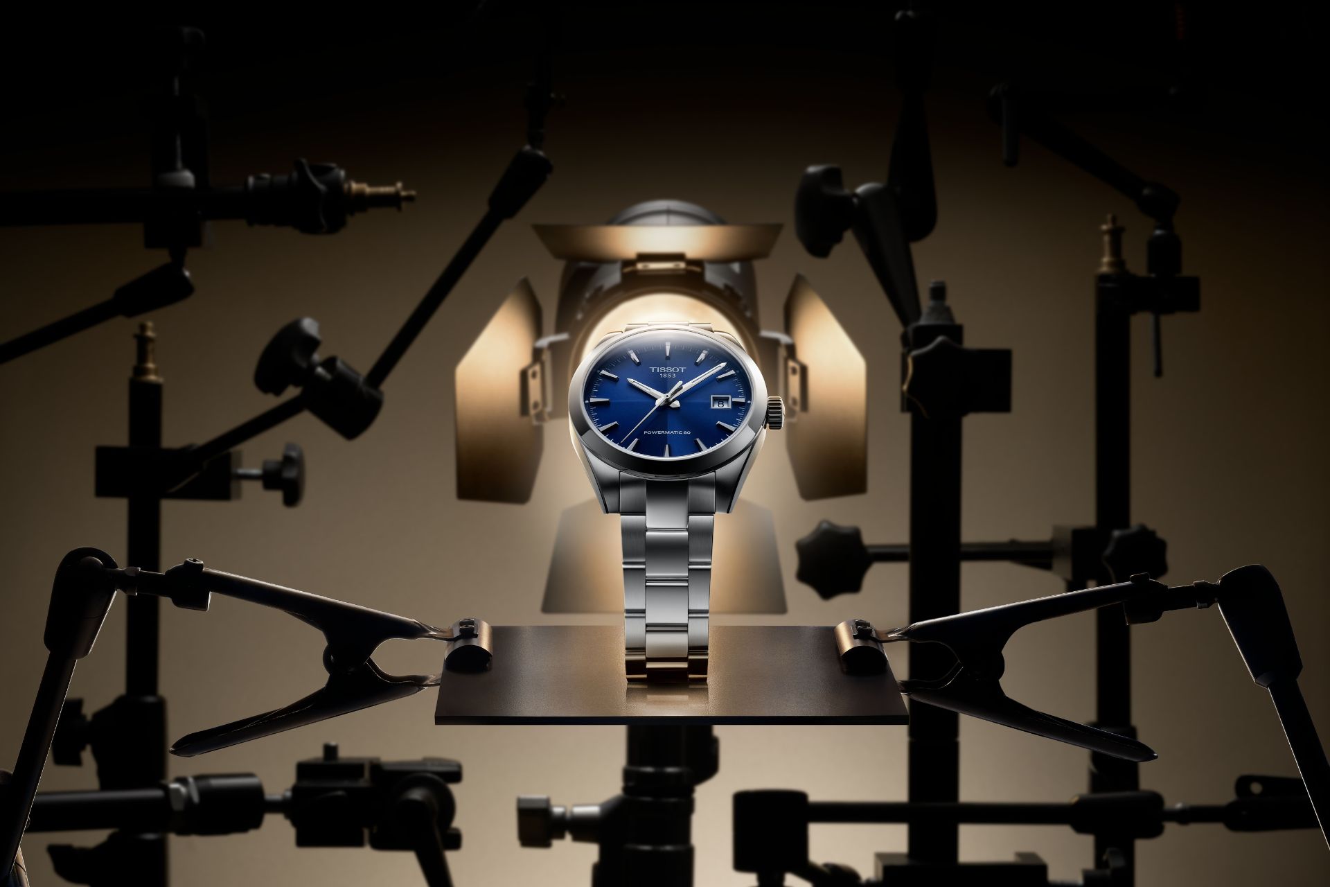
With timeless aesthetics, impeccable finishing, and mechanical excellence, the Gentleman collection by Tissot is tailored to the modern gentleman, and is now offered in
We use cookies to improve your experience on our site. By using our site, you consent to cookies.
This website uses cookies
Websites store cookies to enhance functionality and personalise your experience. You can manage your preferences, but blocking some cookies may impact site performance and services.
Essential cookies enable basic functions and are necessary for the proper function of the website.
Name
Description
Duration
Cookie Preferences
This cookie is used to store the user's cookie consent preferences.
30 days
These cookies are needed for adding comments on this website.
Name
Description
Duration
comment_author
Used to track the user across multiple sessions.
Session
comment_author_email
Used to track the user across multiple sessions.
Session
comment_author_url
Used to track the user across multiple sessions.
Session
These cookies are used for managing login functionality on this website.
Name
Description
Duration
wordpress_logged_in
Used to store logged-in users.
Persistent
wordpress_sec
Used to track the user across multiple sessions.
15 days
wordpress_test_cookie
Used to determine if cookies are enabled.
Session
Statistics cookies collect information anonymously. This information helps us understand how visitors use our website.
Marketing cookies are used to follow visitors to websites. The intention is to show ads that are relevant and engaging to the individual user.
You can find more information in our Cookie Policy and .
Subscribe
About Us
Contact Us
Join our newsletter and get the latest news and articles sent straight to your inbox weekly.